Actionz - Activities booking App
Inconsistent, unfinished, and disorganized. That was the state of this project when my client contacted me for help. But... Why? How did it get to that state?
OVERVIEW
Actionz is a location-based management and ticketing app. What’s special about Actionz is its efficiency and the detailed content it holds; It enables the user to view curated activities along with well-written information that contains the most important things that need to be known, creating freedom for the users to do everything in one app instead of switching between different platforms.

PROBLEM Without any defining standards and guidelines for the interface, one could clearly see the lack of user experience consideration in the project, and that is exactly where I played a leading role in fixing.
1 I first analyzed each screen one by one to determine where the bigger and less noticeable issues were, researched demographics, and created an informational architecture and a general user persona.
2 I then strived to create consistent design guidelines for buttons, fonts and colors, as well as readjust alignments within components throughout the entire app.
3 Finally, I worked on revamping the app’s structure and the content it holds, eliminated dead-ends, and solved problematic functions to form a pleasant user experience.
ASSESS THE PROBLEMS
Information Architecture (IA)
Jumping into a project with 200+ screens can be overwhelming at first, but once we break things up bit by bit and work on them separately,  picking up the pieces becomes much easier! The following IA was the final result after I put together which sites should be reworked, removed, or added.
Secondary research Statistics
I analyzed the source of visitors as well as the nationalities of the residents, and once finding my two main audience targets, I found that:

VISITORS The majority of the visitors come from Europe and GCC regions. These regions combined accounted for over 42%.  South Asia is another significant source of visitors to the UAE, with over 5 million visitors in 2019. The third-largest source of visitors to the UAE is the United Kingdom, with around 1.2 million visitors in 2019.

RESIDENTS The population of the United Arab Emirates is very diverse, with a large number of nationalities represented. The majority being Indian, making up around 2.8 Million. It is estimated that only around 30% of the population can speak Arabic.
Secondary research User persona
Based on the data I have gathered, people from all over the world with all different backgrounds visit and reside in the UAE, which means that English is not everyone’s first or second language. Thus, it was important to refrain from complex language usage and emphasize more on clear and direct communication throughout the app.
UX Audit
This was one of the most time-consuming stages, in which I thoroughly looked through each screen and listed errors that were sent to the client and worked on throughout the later stages of the project by me. After noting down the design decisions for all of the screens, I was able to divide these inconsistencies into 4 categories: typography, alignments, colors, and buttons
Typos
Everyone makes mistakes and misspells words every now and then. However, it is always important and should be expected to proof-check professional work. Misspellings such as the ones shown below were found all over the app. Since I speak English fluently and tend to pay close attention to detail, it was one of my tasks to locate these errors and fix them.
DEVELOP UIKIT
Typography
When designing websites, it is generally preferred to have no more than 3 different fonts. When users are faced with too many, the text content appears to be unprofessional and imbalanced, which is not ideal for the user’s reading experience. The typography should be clean and legible, with strategically different weights and styles. That is where the app has trouble with, since it had 10 different fonts.
After having talks with the team and comparing different fonts, I ended up choosing 2 of the following fonts for the app, namely Poppins as the main text and SignPainter exclusively for the categories page.

Poppins belongs to the Sans Serif fonts. It is easily readable and geometric since it has wide, round symmetric details. It also has a quirky and playful feel to it, which is ideal for this app’s brand and look. It is important to note that although cursive fonts can look pretty, they should be used sparingly and as display fonts. This means that they shouldn’t be used in heavy content sections such as in body text, otherwise, they’d be a detriment to readability, inevitably affecting the user experience.
Misalignments
One of the most time-consuming things in this project was identifying and uniforming the alignment differences throughout the screens. Each screen was worked on during a different timeline with different designers, which caused spacings such as margins and paddings to be inconsistent. One could say that such mistakes are not easily noticeable, it’s only a few pixels after all, therefore they are not necessarily important to focus on. However, the more inconsistencies users face, the less faith they have, especially when they are adding credential information.
Take a look at the following prototypes, with the left side showing inconsistency, and the right side consistency.
Alignments
No matter how subtle or quick they may be, unpredictability can and will leave a bad impression on the users. The last thing we want is for them to not take the app seriously due to mistakes that make the app look sloppy and unprofessional.
I began by breaking down screens into components and focused on maintaining the same spacings in multiple of 4 or 8 pixels for each element.


The general allignment rules applied for all screens:
App Colors All brands have their own colors, and these colors are categorized into different levels of hierarchy, which typically consist of one Main (primary) color, secondary colors, and finally, accent colors. The golden rule for the division of the color categories is 60/30/10. Now, take a look at these screens below and try to figure out which colors are primary and secondary:
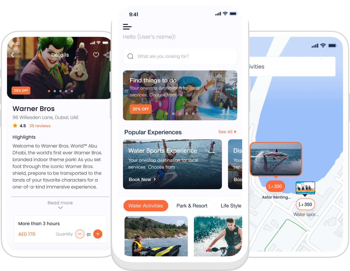
What is evident throughout these screens is the imbalance between the blues and the oranges. There is no hierarchy; they are both equally fighting to be the primary color instead of being placed under either primary or secondary colors. This creates confusion and a design that is overstimulating. There is too much to focus on and the user needs more time to distinguish between valuable information and less important information.
After conducting meetings with the team, I was given the green light to eliminate the blues and have only orange be the app’s brand colors, with gentler black and white as secondary and accent colors.
Buttons I made all the call-to-action buttons orange and unified the color, so that there wouldn’t be multiple orange shades anymore.
Contrast The body text was usually gray. However, this was not up to accessibility standards. Text is best seen under contrast, therefore, I changed the body text to be much closer to black, successfully improving the readability of the app.
Buttons and Icons Have you ever felt confused when you noticed that the buttons on your shirt generally looked the same, or that the buttons on your remote controller all came in the same shape and color, except for when a button had a special function?

The answer is most likely to be “No.”
The reason is that in these previously mentioned cases,
buttons are meant to be uniform and consistent, which is precisely why it is confusing and out of the ordinary when an app has... 47 different styled buttons!
I divided the buttons into 3 categories, and only used them.
REDESIGN
After applying everything that has been mentioned so far, here are the results! Please note that this is just an overview, as showing every single screen would turn us all into victims of...infinite scrolling. ;)
TAKEAWAYS
shoulda coulda woulda
This was the largest project I have ever worked on, and although there was a lot of back and forth between the design decisions and the process itself, I learned how to better break up things into little pieces and connect all the puzzle pieces bit by bit. This was a great experience and the challenging moments definitely helped me improve a lot of my skills - from communications to design reasoning and application. I would love to hear your thoughts on this project!