WRAHA - World Restart a Heart in the Arab Countries
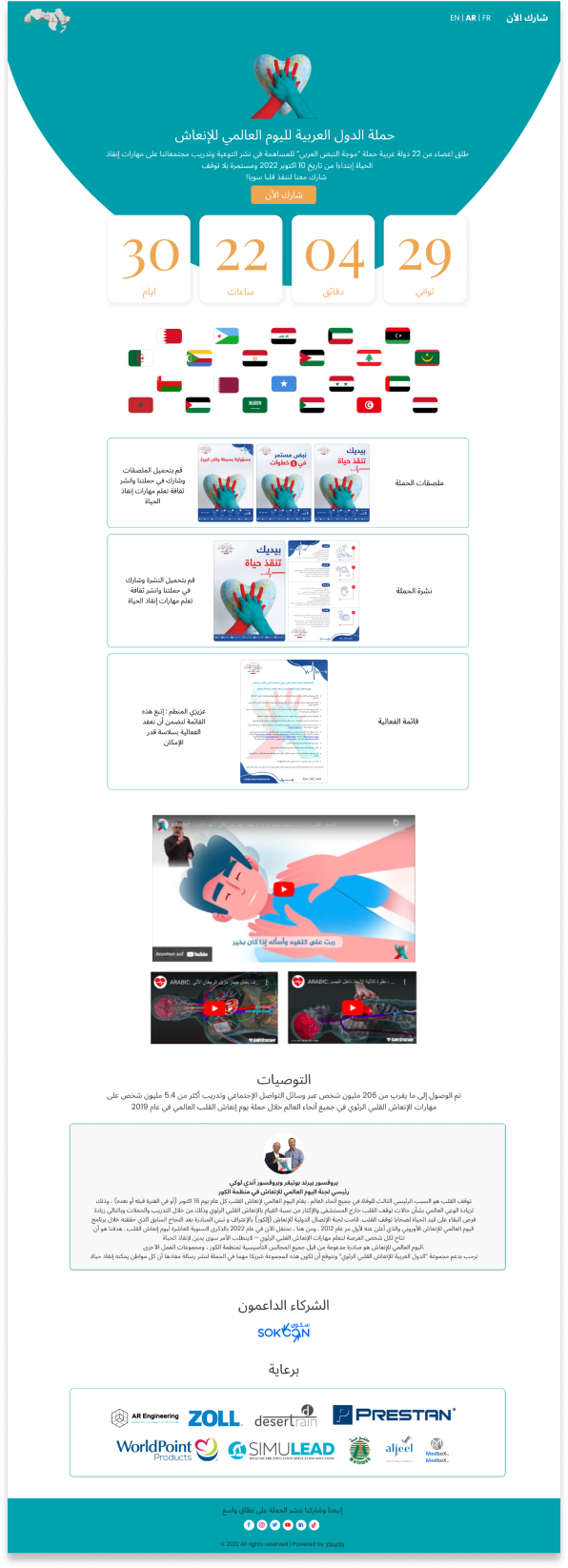
With only about a month left until the CPR Arab World campaign starts and no website for participants to register, or keep track of future, upcoming, and past campaigns, WRAHA found itself in a quite difficult situation. Luckily, superman is here to save the day. Uh- I mean, your super duper cool UX & UI designer Zahraa is here to save the day!
OVERVIEW
WRAHA is an Arab organization with the goal of helping those living in the 22 Arab countries learn how to do CPR and provide immediate assistance during emergencies. The campaigns that are held have been shown to have raised awareness regarding first aid across the Arab world, as well as provided face-to-face training in CPR.

PROBLEM WRAHA did not have a website for people to be informed on when and where the campaigns are held, nor for those wanting to register a campaign. This is where I come in the picture to plan and design the website from start to finish.
Define, Empathize & Ideate
Define
At first, the concept of the website wasn’t difficult to grasp, the screens were few in numbers, and the content they held was simple. Thus, the project did not require a deep dive into researching data or analyzing competitors.  Only two screens are required:
A home screen showcasing:
a Participation screen for visitors to register a campaign by:
Well, that was the initial plan. Remember this, it’ll be important later.
Empathize
There are two types of users who are the main targets of this organization. Those who are interested in learning about CPR, and those organizing the campaigns.
Ideate
I was told that the website needs to look professional, but also inviting. I was then given a selection of colors to work with.
This made things a little tricky since the logo did not have any hint of orange in it, as it was rather red and blue. Looking back on things, I would’ve tried to share my thoughts on this and given more consideration in replacing the orange with red.

Since the campaign mainly focuses on CPR, and the logo contains a heart as its main focus, I decided to have the hero be in the shape of the bottom part of the heart. I also suggested adding a countdown, to emphasize how much time the potential participants have left. I was given the green light on this.
I determined that it’d be a good idea to include flags of all the arab countries,
in order to express a sense of togetherness and inclusivity. The team liked my concept, so I incorperated the following 22 flags into the project!
Wireframes
Long story short
These are the how final versions of wireframes on desktop and mobile turned out. I was also tasked with creating both the Arabic versions as well as the English ones.
Hero Section
I had the countdown take a lot of space to indicate a sense of urgency, I also strategically placed it right after the CTA, so that the user will quickly be able to find their way to participating after looking at how much time is left.
At the time of making the wireframes, the writing content was still not finished. I learned for the first time that there was actually a "lorem ipsum" version in Arabic!
Flags
Originally, I divided the flags into 2 parts, above and below the poster section. However, once I sent the wireframe over to the team, I quickly received the feedback that they looked like Formula 1 race flags. After having a laugh together, I changed the positions of the flags.
Flyer
There initially weren’t many details regarding the flyer, since its content was still undecided. However, as more time went by and more information was determined, we ended up with 3 sections for the poster. This addition was made only after the wireframe stage - which is perfectly fine! That’s just part of the design process. Some ideas simply require change and adjustments throughout different stages sometimes.
Videos
During the wireframe stage, the team has not decided on what type of video will be showcased, on which platform, and whether it's only one and not more. Thus, I created a neutral design. Once the decision was made that there would be three videos linked through youtube, I created a second version.
Testimonials
This section also went through changes, since there was a misunderstanding. I was under the assumption that there would be multiple ones, so I created a design that would be flexible to add as many as needed, however, soon after it was decided that only one specific testimonial was going to be showcased.
You know what? I’m noticing a pattern here. Almost all (i.e: 3) of the things that have changed, happened in 3. Hmm….🤔
Design
Overview
Now it's time to stylize and make everything look pretty! Since I created the wireframes in a high-fidelity format, there weren’t any major changes once I transformed the wireframe screens into real designs. When it comes to the form, I did struggle with picking between orange and blue as the primary color, since the CTA button on the home screen was orange. I ended up with blue, due to the bright orange on a white background resulting in a bad contrast and going against web-accessibility guidelines.
Additions
Home screen Three new sections were added, namely the three categories of flyers, the sponsors and the footer.
Form We decided that it’d be best if there was only one screen with two translations, instead of two screens in different languages, since the information was rather compact and brief.
Expansion
Nov/9 -  Jan/29 2023
Remember how I said that the two screens were "The initial plan" at the beginning of this case study? Well, that was the original agreement. Except that once the campaign started and everything was all said and done, the organization liked my work and decided to contact me after some time again for me to design an extension of their website, yay!

The expansion has three main goals, namely
Wireframes 2.0
Home screen After a brief meeting, we decided that the home screen should:
- contain WRAHA’s mission and vision
- raise awareness for CPR
- include campaign video
- display a map with the 22 Arab countries
Buuuut that wasn’t actually what they wanted, mainly because there wasn’t a section dedicated to the pieces of equipment, and also since they had other sections in mind. After going over the details once more, the following was the second version of the home screen wireframe that I created. Now, I had many issues with this which I communicated with the team. First, I worried about the responsiveness of the hero section, especially on mobile. Secondly, the video section was now gone. I also did not find the title “WRAHA” on top of the flyers informative enough. Lastly, the participation form was redundant and the members' section seemed misplaced.
After reconsidering the entire purpose of the new home screen and getting more information on the exact content that the expansion will hold,
I created a new structure for the third and final version of the home screen.
Media There were some ideas brewing for a “media” page, which would be a customized screen dedicated to showcasing all campaigns related to each Arab country. However, due to the lack of time and the concept straying further from the main goals, we scrapped this idea.
For the equipment screens, the team was not sure if there should be individual equipment, or if the user can directly take some sort of action. I came up with the 2 following concepts, with the right one being ultimately chosen. This second wireframe was of course just a simple wireframe, which then, after more talks, evolved into a much more detailed version.
This was the result; a template-type of screen, which would be used for all the other sponsors. As for the main sponsor, ZOLL, I was sent catalogs of their equipment, and my task was to redesign them into “website” screens, with new alignments that would be responsive. This will be shown in the design stage.
The purpose of this section was to showcase the poster, inclusivity, and access to the campaign screens that I designed at the beginning.
Design
Home screen At first, I faced issues with choosing the brand colors. Should I keep them the same orange and blue, even though I did not like the end result with the orange? After testing the colors out on the hero section, I went with red and blue. The team also liked this, since the orange and the red separate the campaign screen from the new expansion screens.
I ended up with a minimal look for the map, since filling it out with colors made it hard to differentiate between the borders. They could also cause potential confusion or misunderstandings since users might wonder why a region is colored in red or divided in a certain way. I was asked to add the flags since they liked them a lot, as well as to mark every country.
Once scrolling down, the user can visit the campaign website in their respective language.
The equipment section needed to stand out from the other ones, which was why the first version of the design did not satisfy me. The second version took more size and had more prominence, but the design was too different in comparison to the other sections. I chose the third version, since it had a clean, matching style, yet also gathered attention since the entire background was in gray instead of white.
Zoll My main task here was to convert the catalog styles to one that is responsive on websites. Thus, my main concern was not the content, but rather the styling.
Lessons I learned
shoulda coulda woulda
Communication What caused us to keep going back and forth between screens were the misunderstandings. Had I phrased my questions better, designing the screen for the products/sponsors would have been a much smoother and more efficient experience.

Time estimation I slowly noticed that I tend to have a pattern of either overestimating or underestimating the time it takes to get something done, the case usually being the former. This slowed down the process since I would finish something earlier than expected, and since the client/team was still working on certain things. This meant that I wouldn’t have any tasks for days. If I had estimated correctly, our paces would’ve matched, creating a more productive timeframe.

Tidier Workspace This is definitely something I’ll keep in mind for the future. I didn’t realize how confusing my workspace could be sometimes, until I had to specify which page was where. The developer was a little confused and I had to point out where a certain screen was... with a big arrow of course!