AHS - Junk Removal Service
OVERVIEW
PROBLEM AHS is a moving and junk haul services company that heavily relies on traditional advertising and does not have its own online presence. The challenge is to establish a strong digital presence for AHS through an effective and user-friendly website that showcases its services and uniqueness, builds trust with potential customers, and enhances its overall reach.
Now, as someone who has lived her entire life in the UAE and moved around 5 times, neither I nor my family have searched up "junk, hauling services" or "moving company" online. We simply skimmed through the newspapers or stumbled across these cards that get slipped through our front doors.
Since my team leader was an American who happened to live in the same state as the AHS removal junk company, I asked her about this. She told me that people typically look these companies up online or hire them through word of mouth. This helped me realize the importance of locations and the differences between cultures and the decision-making that comes with them.

It quickly became clear to me that I would need to research competitors by
REGION, analyze their websites, and determine our target audience to get a better idea for creating the most optimal user-centered website.
I first started by reading our client brief thoroughly, and then I created a short summary of our project's outline
As for the project’s process, I spent the majority of my time working on the first and second stages
Define, Empathize & Ideate
Research
With the information that I have, I searched for our 3 main competitors who were not only based in the same state, namely Maryland, but also located in Washington D.C. Thus, they were our biggest and closest competitors. I then created sticky notes to pinpoint the difference and similarities, as well as what makes them stand out.
User Centered Design Canvas (UCDC)
We usually don’t do user personas, and since our time was very limited, we couldn’t conduct interviews or constantly test prototypes this time either. This made me come to the decision of creating a User Centered Design Canvas for the first time.
Information Architecture (IA)
In order to visualize what our competitors have prioritized, and to better understand their websites’ hierarchy, I used Post-it notes. I had lots of small leftover ones from my previous projects, so this was the perfect opportunity to put them into use. I like them because they give me the flexibility to shuffle them around and picture sections and subsections in different ways without taking too much time. This made it easier for me to compare between the structures and to better strategize what goes where.
After engaging with the team and the client, and narrowing down which screens the client wants and which ones we could deliver within the time frame, this is how our IA was starting to look like. A digital, more in-depth version will be shown later on.
Images AHS put a great emphasis on being a local business and wanted to convey a sense of both professionalism and at the same time one of a community. To build that level of trust with their customers, we decided to include numerous pictures of their team at work in order to showcase the hardworking individuals behind the company, rather than simply displaying images of furniture. Thus, I was tasked with narrowing down thousands of images, categorizing them, and then selecting the ones that speak out to the users the most.
Wireframes
Competitor’s design analysis (overview)
Before jumping onto the fun part, I wanted to first note down points that summarized the websites from a design perspective. I asked myself three questions:

1. How did they want their website to appear to the users?
2. In what way did they best express their content?
3. What was their strategy?
Homepage
Hero With all of this in mind, I began creating the wireframes for the home page.
I didn’t create the five versions on the spot- They happened after multiple feedbacks. For the first version, the design was too modern and different from the company’s image. The next versions were more to the client’s liking, however, it was still missing something.

My problem was that I kept focusing on things like how stylish the hero needed to be or the amount of attention the CTA can gather. I then kept changing the section that’s after the hero, because I thought that that could be the main issue. I asked myself “Would the users prefer to learn about the process, take a look at the services, or find out who the company wants to serve? How catchy is the title anyway?” However, although those questions should be considered, I realized that this wasn’t going to solve my problem. I decided to forget about the next sections and focus solely on the main section.

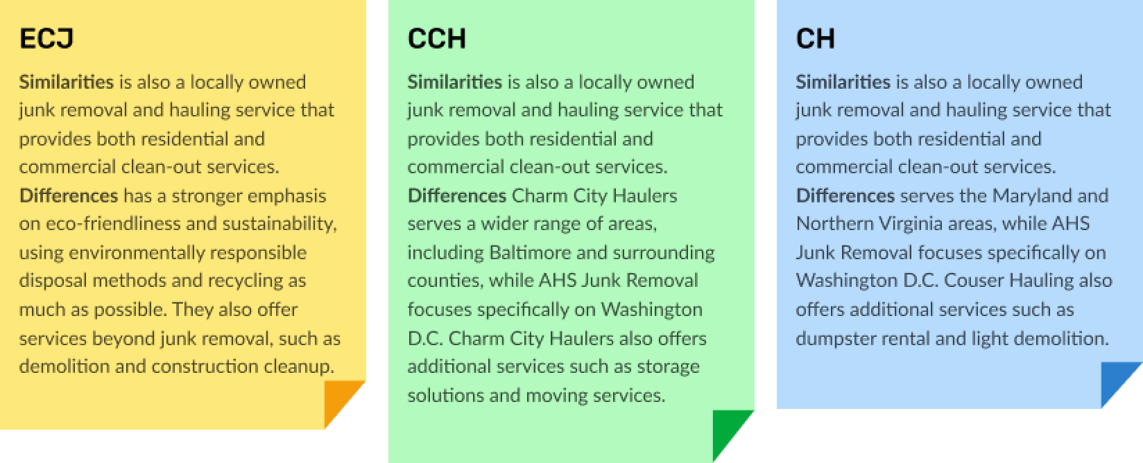
Okay, so our client was looking for something that speaks to the users and represents the company. Well, the logo is a superhero, and the reason for that was that the company wants to look out for its people and its community. How about... putting that superhero logo as the main image, and the header looking more as if it had come right out of a comic?!
Now that’s more like it. This was loved by everyone, and as for the second section, we discussed it together and came to the conclusion that it’d be most effective if the types of services were showcased before everything else. And so we were given the green light on moving onto the next sections, which usually only depended on stylistic preferences and design choices that related to the brand.
Why Us When it came to this section, not much information was given, other than that the text was supposed to only be in one paragraph, which is why I made the following versions.
The client however wanted a more simpler look, especially after deciding that the section will be divided into three parts. As a result, I created a fourth and final version of this section.
Full Homepage This was the final version of the homepage. This of course took many trials and errors, which is completely normal and expected! There’s so much to learn during new projects, and new information will keep coming in.
Who We Serve, Services & Pricing
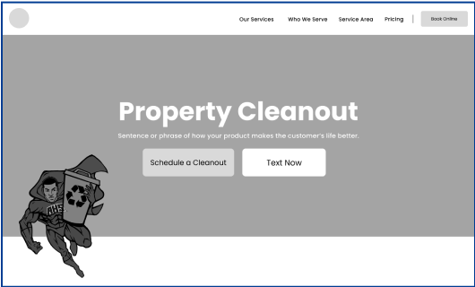
To maintain consistency with the superhero theme that’s going on, I created multiple variations of the homepage’s hero section. This allows us to showcase different aspects of the theme in each new category while keeping the overall look and feel cohesive.
CTA The CTA buttons for booking or scheduling services would lead to the following pages. At first, we were still discussing the contents of the page, but after going back and forth, the second wireframe was the result that I created.
Other The next sections were similar to those in the homepage, except for a couple design and content changes, so that they would match the respective sites better.
Blog This was an idea in the making, however, we asked the client to reconsider this, since during that time, there weren’t any blogs ready to be published nor did the client have the resources for them in the first place. The blog wireframes didn’t end up seeing the light, but these were the concepts that I created.
Feedback
UI Of course, the main credit goes to the designer for turning these wireframes into life and doing such a great job at it.  All I did was assist, which meant fixing & adjusting the alignments, text hierarchy, color contrasts, and adding the appropriate photos.

Big Picture During this project, I learned the importance of looking at the big picture, instead of focusing too much on specific details. For example, when it came to the home screen’s hero, I tried too hard to think outside of the box and create modern solutions. I forgot the “big picture” - the company’s brand, the image it wants to show to its users, and the story behind it. Luckily, I had smooth sailing once I learned my lesson!

Engagement The client was very active in this project. We would get feedback and opinions quickly, and their comments were clear and effective as well. This made me realize how vital having an engaging client is, and I took note of encouraging and motivating future clients to be as expressive as they can.